Example Inspiration Board
One look of an inspiration board is all you need to know exactly what someone wants in their home project. Let's look at some examples of what I mean, with an extremely brief explanation.
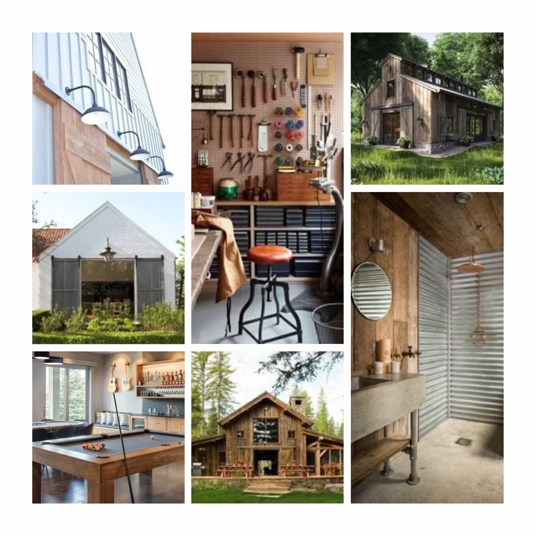
Example #1

This is a board I created for our 'Barn'. From this board, left to right, top to bottom, you can see that we wanted goose-neck lighting, an organized workshop, barn shape with cathedral-style windows, large, large large barn doors, a blend of rustic elements, a fun but not huge rec. room, and again, the iconic barn shape (also that matching lower and upper opening is perfection👌🏼).
The best part is that the barn is a group project, meaning we have our differences in style, vision and budget. Yet, we were able to find the right pictures to help get our individual visions to line up with each others. The budget is another story...
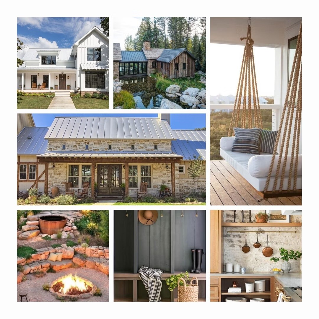
Example #2

This inspiration board is our home 😍
When you're an Architectural Designer like me, your job is to visualize things. I already knew what I wanted my home to look like, but I needed to make sure that Troy and I shared the same vision.
Again from left to right, top to bottom, the first picture was the perfect home to explain the shape I wanted. A 2 storey home with the upper floor built into the roof (low walls with vaulted ceilings) broken up with lower roof over the entry porch (separate from the main roof), a large shed dormer, and a 2-storey gable for the garage and bedroom. This picture did all that explaining. Carrying on, my husband found a picture of a 'wing' which gave us the inspiration for our detached/attached master bedroom, a porch swing, the back covered area and glazing inspiration, natural outdoor spaces, built-ins, and wood kitchen with a stone backsplash - and this picture proved that I could have just that (it also proved Troy's point that it would look good with a concrete counter).
Pro Tip:
We also took our pictures, cut them out, and taped them to the walls of the corresponding rooms to visually explain to our pro's what we're envisioning and, more importantly, reminded ourselves what we wanted to see. It's easy to forget in the moment when you're dealing with 101 decisions.
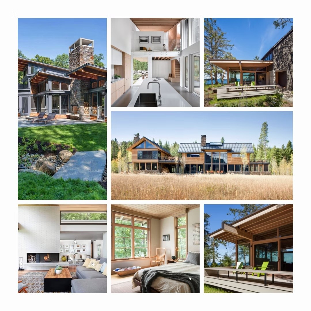
Example #3

Going away from our personal projects, let's take a look at some projects I've created for Potts Design & Co. This project was for a new home located on a pie-shaped, steep sloping lot. The step-back in the shape of the building was required to maximize the lot coverage, and the low sloping, timbered roof was a client must-have. This picture spoke for itself. Inside was light and bright with an option loft, outdoor covered space, exterior materials, large, modern fireplace, tall windows, and exposed ceiling rafters where ever possible.
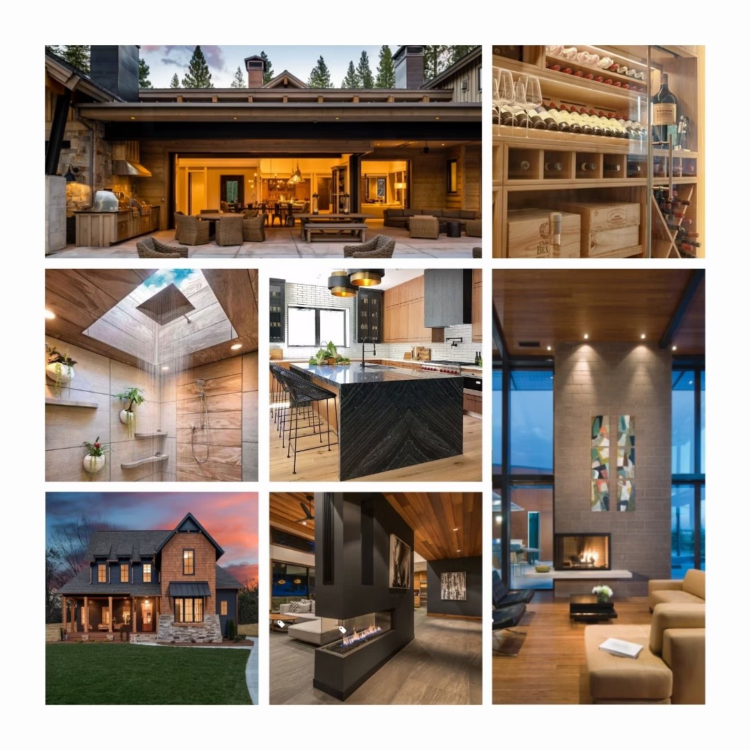
Example #4

Another project designed this past year was taking an existing traditional craftsman home and making it anything but traditional.
Combining craftsman and contemporary with moody materials and rich wood tones with huge features like expansive indoor/outdoor living, wine room, interesting skylight placement, blending the masculine and feminine, 2 storey living with floor-to-ceiling windows, a modernized craftsman exterior, and a 3-way fireplace... to name a few.
While the 1-2 sentence description helps explain all of these inspiration boards, they speak so well on their own that you don't have to say much, if not anything. Now that's the best kind of inspiration board.
Now it's your turn!
Share your inspiration board on Instagram so we can see what you created! Remember to tag us @homeownerhq so we can see it and use the hashtag #HQinspo.
Let's move on to the next lesson