Category
Read Time
Minutes

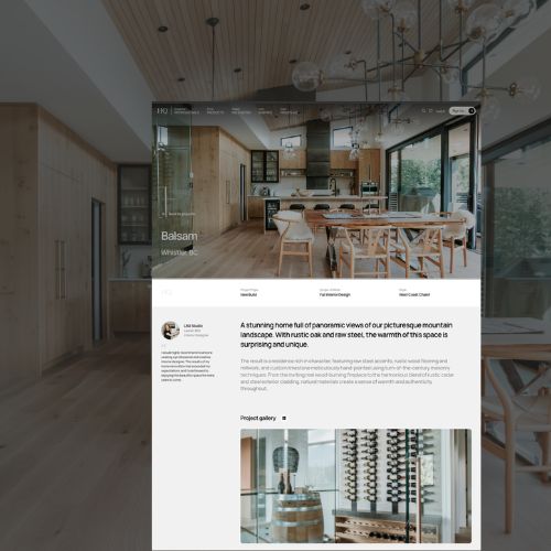
From the very beginning, I pictured the kitchen first and foremost. I mean, who doesn’t think of the kitchen first when you picture your home. Being that it’s the heart of the home, I wanted it to be a space that felt open and inviting but also deeply practical. A kitchen where everything had its place.
Most of my inspiration came from Pinterest (if you love getting lost in boards the way I do, you can follow along here). But more than pretty pictures, I wanted this kitchen to reflect how we actually live.
We spent years living on a boat where every inch mattered, and that lesson stuck: everything needs a home. So when I designed this kitchen, I kept organization front and centre. Cabinets with built-in spice racks, dividers for cookie sheets, trays, organized fridge and freezer storage, even a system for garbage and recycling — I wanted it all thought through. Open shelving became a way to showcase the things I love and use often — beautiful mugs, those cookbooks you reach for the most, and a few of my antiques. And maybe a plant, if it survives me. But no uppers (I’m too short for those to ever be practical).

My husband had a request: a pot filler. I figured it wasn’t needed but when he swore it would make my life easier, I had to give him something (even if he would never use it). My must-haves? A wall full of large jars of everyday nonperishables. Think rice, couscous, cocoa, matcha, etc. The other, a hood fan that didn’t look like a hood fan. I didn’t want you to think “hood fan” when you saw it. I wanted you to think about the stone that wraps the wall, the counter that continues behind the range, and the way the sides extend to the counter like oversized brackets. That mix of texture and structure made the space feel unique.
Some choices came easy: quartz countertops, oak floors that already ran throughout the home, and black accent lighting with concrete pendants to hang over the island. Other choices were a bit more difficult: the debate between wood or painted cabinetry. We went back and forth on this one (and still do) but we landed on cabinetry that echoed the knots in our flooring (because I love the character), and an eventual plan to wrap the wall in stone instead of a backsplash. We designed with the future in mind, knowing we could add organizational details and finishing touches over time since cabinets and inserts don’t come cheap.
But the real anchor of the space was always the island. This was where I imagined informal hangouts, where baking would happen on Sunday afternoons, and where family and friends could gather without it feeling too “staged.” We set a coffee station under the 2 floating shelves for those slow mornings we never want to rush through.
This kitchen was designed years ago, but it still captures the vision I had back then: a space that feels good to be in and works hard for the way we live every day.


Comments
Get more practical tips, real stories, and expert-backed advice for your project.


